I must have been too sleepy when I drove by a place called "HUDSON STOP" and couldn't really figure out what it reminded me of. I did not notice small "COFFEE - DELI - LOTTERY" reading at first. Less than a minute later, I knew exactly what that sign was. Therefore, next time I was driving on Rte 102, I had to stop and take this picture:
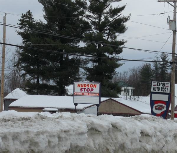
Hudson Stop, a colour scheme that is so familiar to an average Northeastern American resident.
Of course it has to tell unsuspecting observer that it's a coffee shop; or at least coffee is part of its business. It resembles a corporate colour scheme of so very familiar Dunkin Donuts. At least an average Northeastern American resident sees the following on every corner:
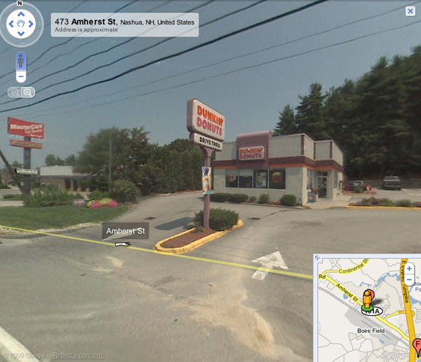
A genuine Dunkin Donuts signage.
Clever idea or plagiarism?
Archived comments
Hudson stop has been out of
— AnonymousHudson stop has been out of business for a long time now.
Has it? Never seen that place
— f1vladHas it? Never seen that place there before, maybe just didn't notice [old sign]. That sign looks quite fresh.